
Duration 6 months
Role Lead Visual Designer
Product Digital Transformation / Responsive website
“Create a brand identity and web transformation that reflects a strong digital approach.”
Severn Trent, a prominent FTSE 100 water company in the UK, caters to approximately 8 million individuals in the Midlands of England and a select region in Wales, supplying freshwater and sewage treatment services. The project's objective was a comprehensive overhaul of the existing website, aiming to enhance customer self-service capabilities and minimize call volume to the call center. The proposed solution involved the development of a new responsive platform utilizing Adobe Experience Manager, empowering the client with efficient content creation and management. The project encompassed an intensive 6-week discovery phase, followed by a structured delivery phase consisting of ten 2-week sprints.

Discovery
During the 6-week discovery phase, meticulous attention was directed towards five primary user journeys, which included:
Account setup
Bill payments
Meter reading submissions
Relocation processes
Issue reporting
Extensive user research involving both the client and customers was conducted to gain comprehensive insights into business and user requirements. The findings from this research were methodically synthesized to construct personas, empathy maps, and cognitive models. These invaluable tools played a pivotal role in shaping the subsequent design phases.
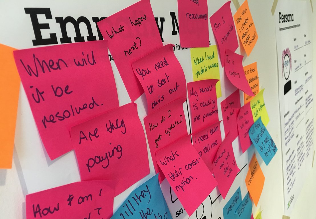

Empathy
We successfully attained a comprehensive understanding of the challenges users encountered on the existing site. However, comprehending the true extent of user frustration or anxiety solely through interviews proved challenging at times. To bridge this gap in empathy, we proactively spent a day at the customer service center. Here, we engaged with call center staff, actively participated in live calls, and empathetically listened to customer concerns.
Through this immersive experience, we gained invaluable insights into the prevalent issues that prompted customer calls, notably:
Assistance with billing or payments
Reporting water-related concerns
Addressing queries related to relocation

Wireframing
Our process commenced with the conceptualisation of preliminary designs, sketching and brainstorming solutions for the identified key issues. Subsequently, these concepts evolved into low-fidelity wireframes that outlined the end-to-end user journeys.

Prototyping and Testing
Functional prototypes were created to embody the proposed solutions, which were then rigorously tested against the existing system. The client engaged an external agency to conduct usability testing, with our team actively participating and diligently documenting the observations.
The insights derived from the testing phase were seamlessly integrated back into the design process, fostering iterative improvements that were centered around human usability. Key findings from the testing encompassed:
Ambiguity and complexity in language, posing difficulties for users in understanding the required actions.
Lack of clarity regarding the reasons for varied payment amounts in initial and subsequent months.
The necessity for a comprehensive monthly payment schedule to enhance user comprehension.
The need to elucidate the methodology behind calculating the monthly payment figure.
User apprehension and errors related to reading and inputting water meter readings.
These valuable findings served as a compass, guiding our design enhancements, ultimately aiming for an optimally user-friendly interface.

Design Development
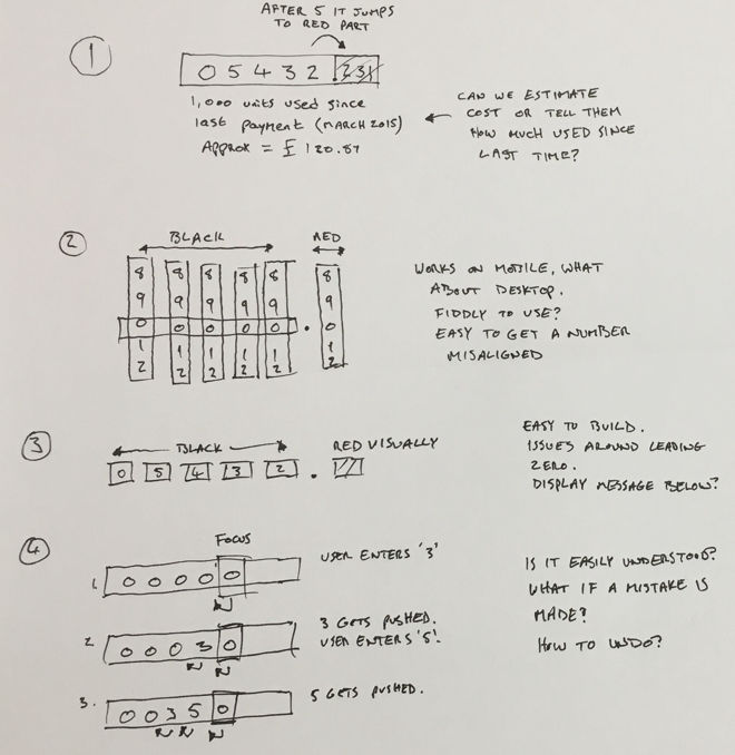
Our specific focus was on understanding the challenges users faced when attempting to read and input water meter readings. In the existing website and across similar platforms from competitors, a basic plain text field was typically used without front-end validation, allowing users to input alphanumeric data of any length.
Although instructions were often provided on how to read and input a meter reading, as depicted in the following images, users frequently found these instructions bewildering, contributing to confusion among customers.

We compiled essential insights regarding the process of inputting water meter readings:
Some participants were unsure whether to include the leading zero.
Several participants mistakenly entered the entire reading, including the red numbers.
Despite reading the instructions, most participants proceeded to input the numbers incorrectly.
Certain participants overlooked the provided instructions.
The majority of participants took approximately 1 minute to complete the reading entry.
It became evident that relying solely on instructions for accurate data entry was unreliable. Instructions could be overlooked or misunderstood. Additionally, the absence of online validation meant users continued to input numbers, hoping for accuracy.
In designing web forms necessitating user input, it is crucial to align with user cognition and behavior. The design should intuitively guide users in context and account for potential human errors.
While contemplating an efficient meter reading input method, the possibility of utilizing a phone's camera to scan the reading was discussed. However, technical limitations prevented its immediate implementation. We explored various concepts to find a universal and viable solution.
Solution
Implement a restricted keyboard input allowing only numeric entry, disallowing text or symbols. Once five numbers are entered (maximum limit), any attempt to input a sixth number triggers the automatic addition of a decimal point (.) with subsequent numbers appearing in red. A maximum of three red numbers is permitted, alongside a limit of five black numbers.
To guide users, a message prompts action if less than four black numbers are inputted. Furthermore, if fewer than 5 numbers are entered, users receive a reminder to verify if their reading begins with a zero, which should also be included if present.

Delivery
The delivery process was divided into two distinct phases. Phase one prioritized enhancements in the pre-authenticated sections of the site, while phase two emphasized self-service capabilities. Throughout the delivery phase, our team was stationed at the client's head office to ensure seamless collaboration using agile methodologies. This included daily stand-up meetings and weekly playbacks to maintain close alignment with the client's business objectives and foster an agile working environment.


